From Superyacht Digest OCTOBER ISSUE 2020 – by Chrissie McClatchie
Superyacht Digest sets sail into the future of yacht design onboard M/Y Luminosity.
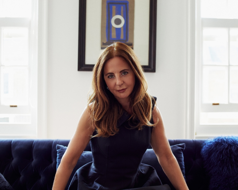
Zaniz graduated from college in New York with a Bachelor of Fine Arts in Design and a dream of working for NASA. An A+ student, who had received both summa cum laude and the Medal of Honor, designing space stations seemed like a logical career step, rather than an ambitious one. “I had both the academic and the creative side”, she tells Superyacht Digest. On top of that, she’d spent her childhood disappearing into imaginary worlds inspired by the books she hungrily read, before trying to build them for real with whatever materials she could lay her hands on. “Since my head was always going somewhere else anyway, I thought that NASA would be the right place for me”.
But pursuing a career with North America’s national space agency also meant returning to college to complete a physics degree. Plus, word of her talent had already spread: legendary designer Angelo Donghia was the first to come knocking and before long she was working on the refit of SS Norway. Other formative projects included hotels, celebrity homes and country clubs. “I was like a sponge that wanted to learn everything”, she says.
She founded her eponymous studio at the age of 25 and now calls London home. While her NASA dreams have been put on hold (for now …), there are the terrestrial projects that are just as otherworldly and where, similarly, only a select few will ever get to set foot: namely M/Y Luminosity.
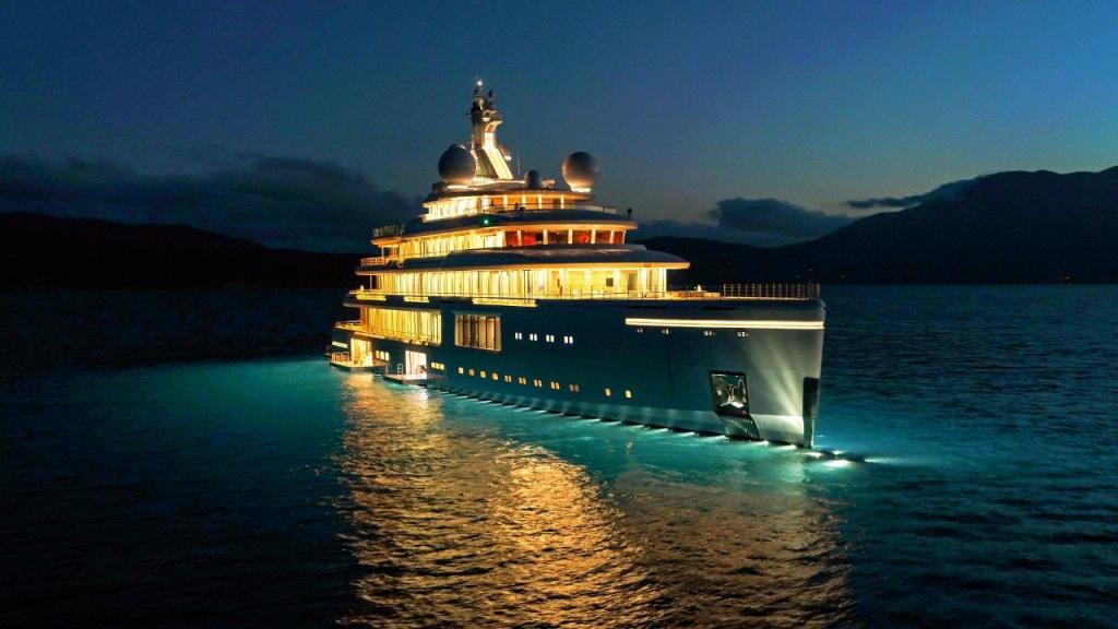
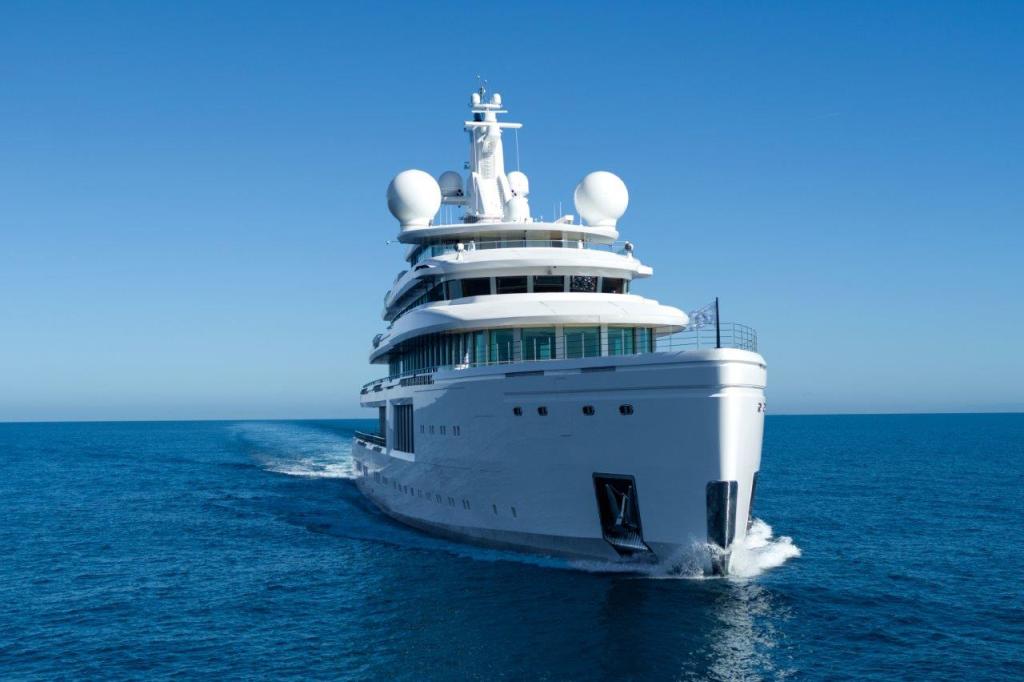
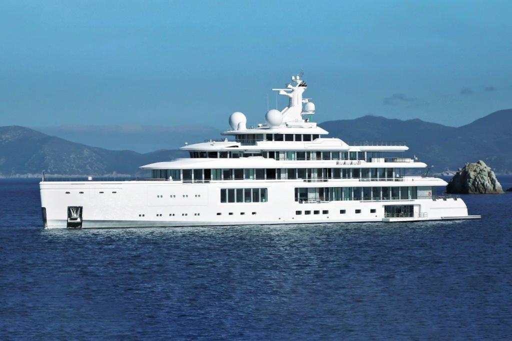
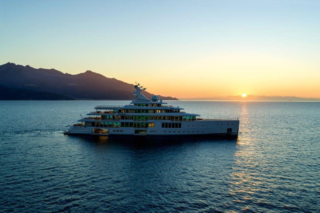
Zaniz has been involved in the project since the very beginning in 2011: not only as the sole interior designer but also as part of the team that designed the yacht’s exterior (which also included Hugo van Wieringen from Azure Naval Architects, Andrew Langton from Reymond Langton Design, and Giorgio M. Cassetta). Launched earlier this year as one of the latest deliveries in Benetti’s second “giga” yacht season, it is a 107.6-metre yacht like we have never seen before. If space is her final frontier, Luminosity is the yachting equivalent.
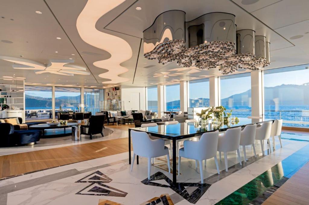
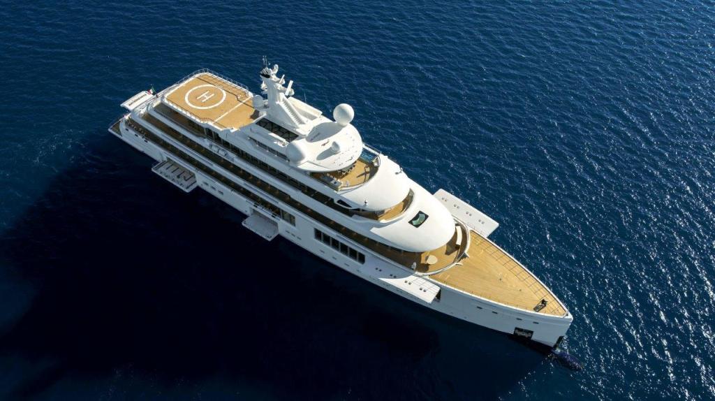
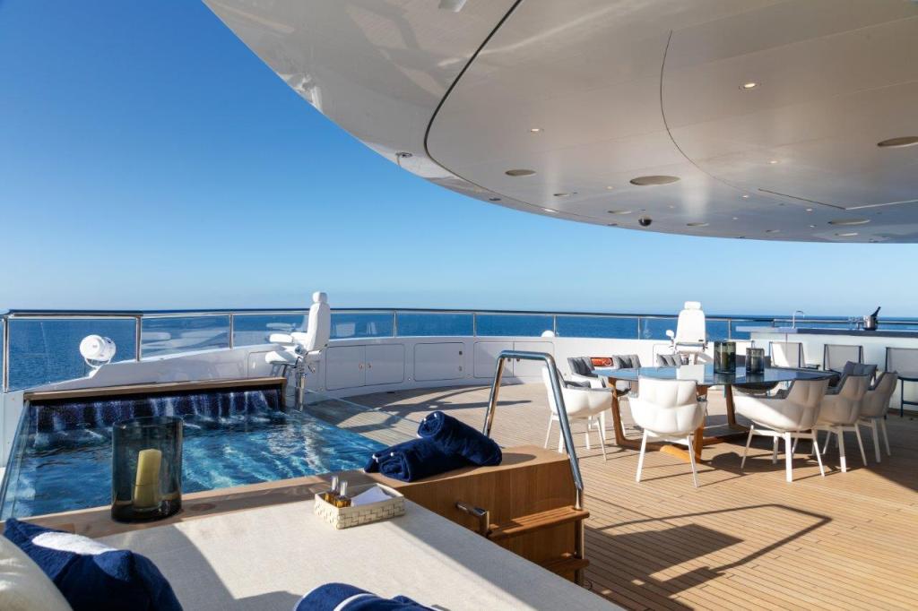
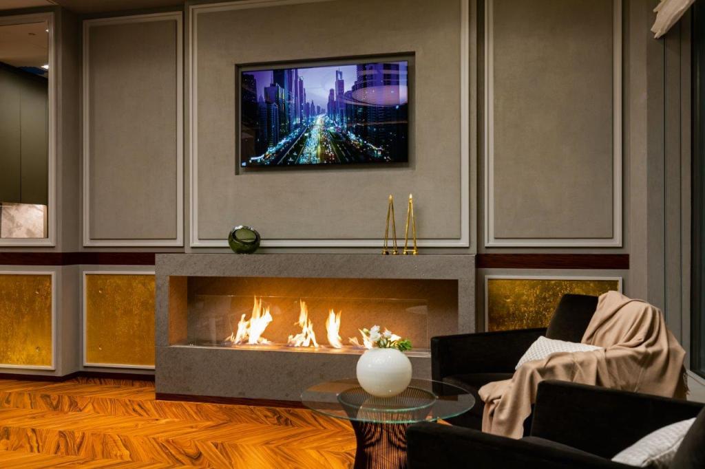
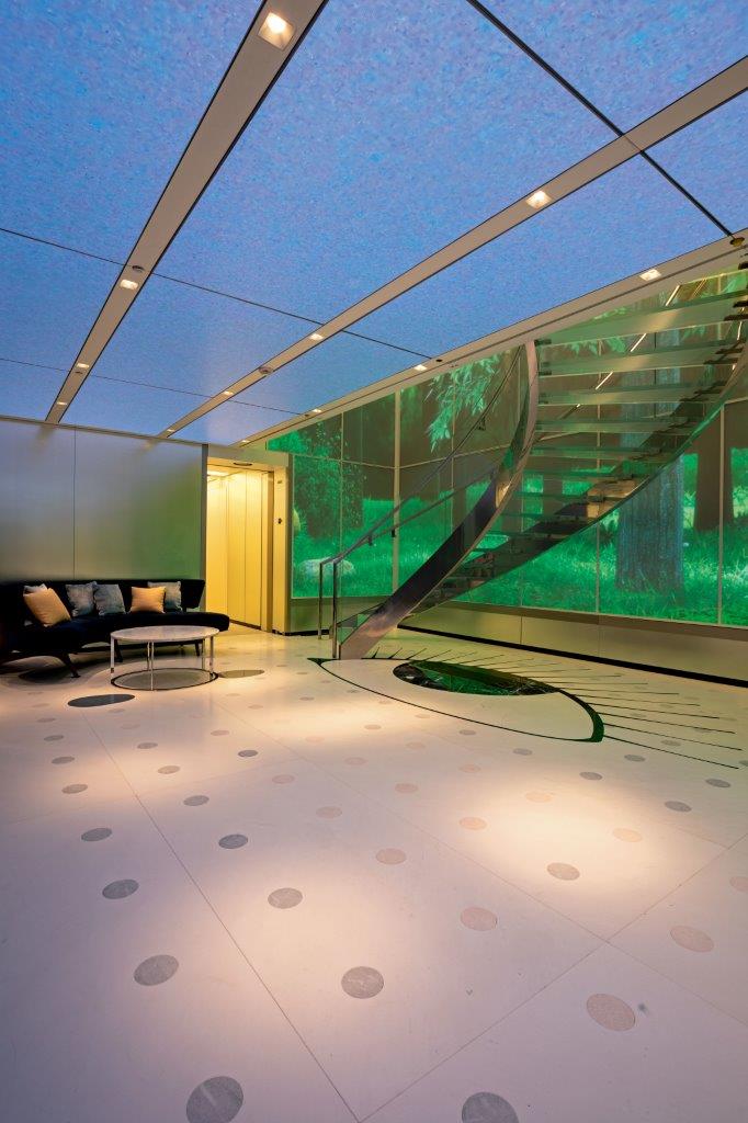
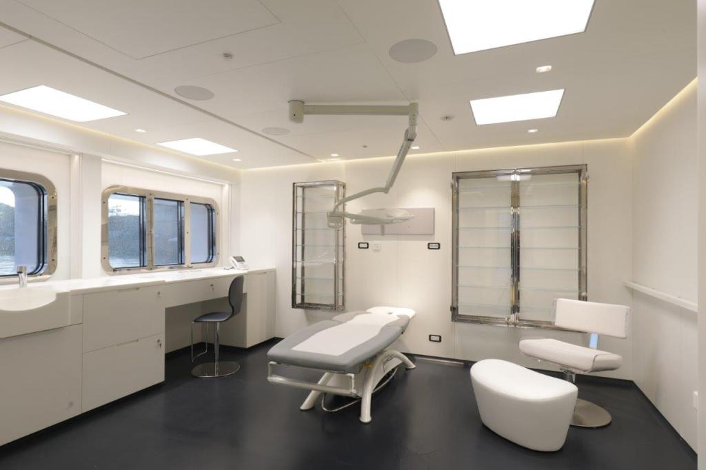
The yacht is on the market with Fraser and Burgess for €225,000,000 and comes with all the trimmings you would expect with so many zeros in the price tag: a hospital, helipad, and beach club so large (230 square metres) and versatile you could live in it and hardly want for anything. As with all yachts of this size, much of the luxury is in the exquisite detail: from the precious stones embedded into the floor to the signs of the zodiac, carved out in marble, hidden throughout the deck areas. “You wouldn’t know where they are unless I told you because they’re so small”, she teases.
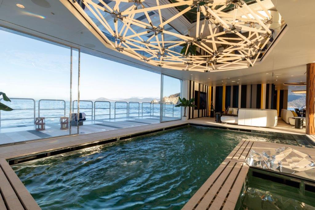
Thanks to its PYC (Passenger Yacht Code) status, Luminosity can sleep 27 in 12 staterooms and it is also wheelchair accessible throughout. “Even to the point that the lift was designed to be large enough to take a full stretcher right from the hospital to the helicopter in one go”, she explains.
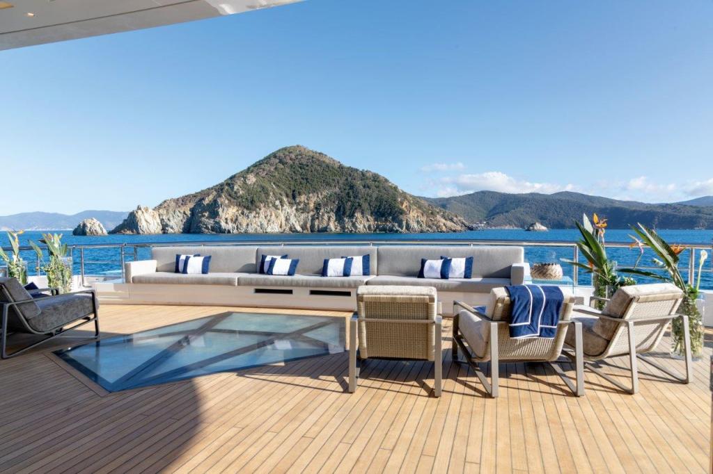
The client intended to spend extended periods of time onboard and beyond provisions for adequate storage, there was a need to incorporate versatility. “The request was to have a variety of experiences in the public interior and exterior spaces”, she explains. One such example is the owner’s foredeck area: “You can play badminton because there’s a place for the net”, she explains. “Right after, on the same deck area, you can take a shower then lay in the sun or use the touch and go helipad. Then there’s a bar area and table for dinner. You could live your whole day out there”.
Ever-evolving
What makes this yacht a vision of the future, however, is the way it has been prepared for tomorrow’s innovations. “The client wanted the yacht to be future proof and this was hammered into us from the very beginning of the project”, she says. Many solutions have been integrated into the vessel to allow it to operate and evolve as technology does.
“The biggest future-proofing decision was to go the route of diesel-electric propulsion systems”, Zaniz says. Its battery system is the largest found on any yacht today. “This allows the vessel to operate silently for a prolonged period”, she continues (12 hours, to be precise). “The design of the system also lends itself to being converted in the future when technology such as hydrogen fuel cells are refined for use onboard yachts”, she explains. Once a solution is available, the yacht can be retrofitted by replacing the battery with the new technology while remaining hybrid.
“Luminosity is also filled with a bespoke heat recovery system, which takes heat from the diesel generators and uses it to heat other systems onboard, such as the swimming pool, the jacuzzi, and to save on electrical power”, she continues. Other energy-saving solutions include a recovery system that allows the use of water distilled from the air conditioning systems to wash the decks.
“We’ve managed to develop a yacht that’s technologically advanced, future-proofed, efficient and respectful of ecological issues”, she says, adding that it was also a client request to keep everything to the bare minimum in terms of serviceability and maintenance schedule. “As a designer, being told that limits what you can do, but at the same time it gives you a problem to solve: to make the designs look different with the same components”, she explains.
Everything illuminated
“Since the beginning of my career, I’ve worked cross-discipline. I always thought that to be normal”, Zaniz says. From A-list homes to superyachts, non-disclosure agreements (NDA’s) have been as common in her career as sketch pads and mood boards. Luminosity is one of the rare projects she can talk about.
“It all started on a scrap of paper”, she laughs. By 2014, she had completed her drawings and specifications. “We started to approach shipyards”. Benetti was selected. Did she ever expect the project to take nine years? “Never”, she laughs.
Flexibility, she says, was key, “to retain as much of the original design as possible”. She may have battled Benetti’s engineers over the size of the mullions, but the brief never changed: light, connection to the sea and originality.
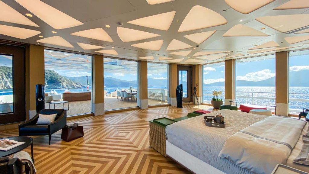
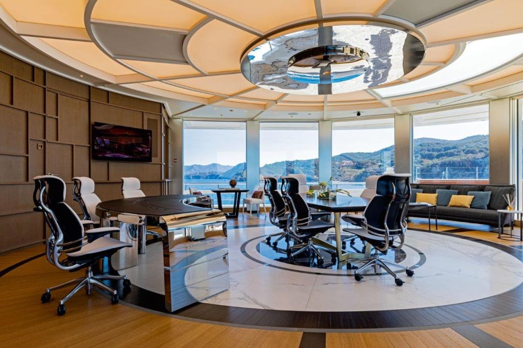
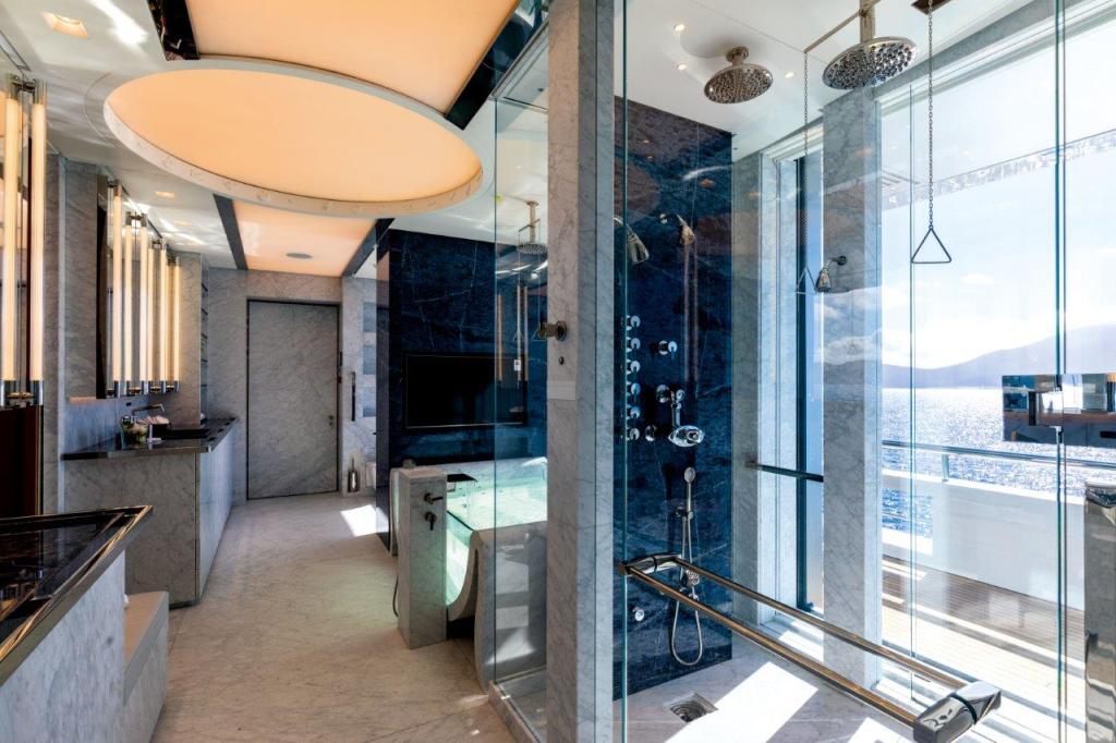
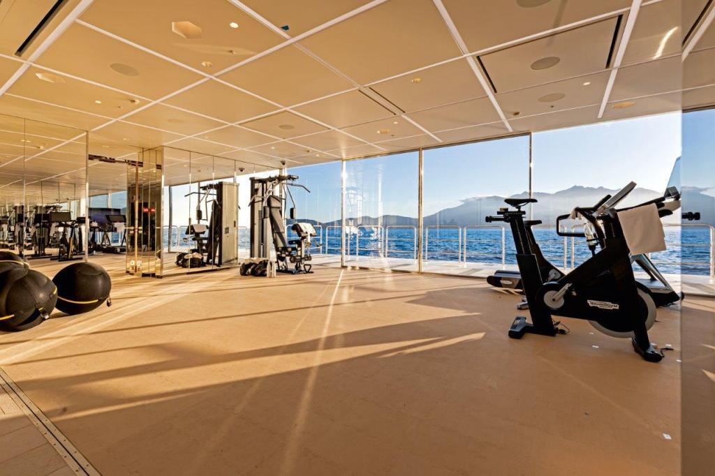
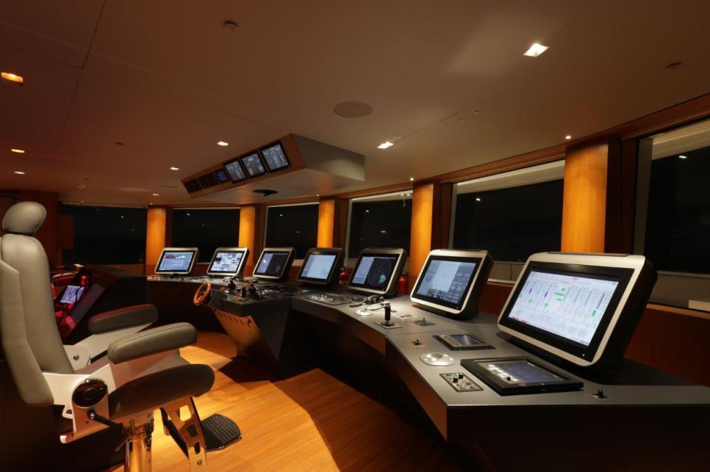
The point where this trio intersects is undoubtedly the windows which cover more than 800 square metres of the vessel: much of them floor-to-ceiling (on the main deck alone, the ceilings are three metres high). Of course, it took cutting-edge technology to achieve this: “There was pressure to use smaller windows because my original design had these big windows that didn’t exist,” she says. In the end, Benetti went through research and development to have them made.
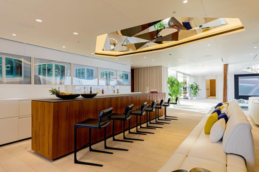
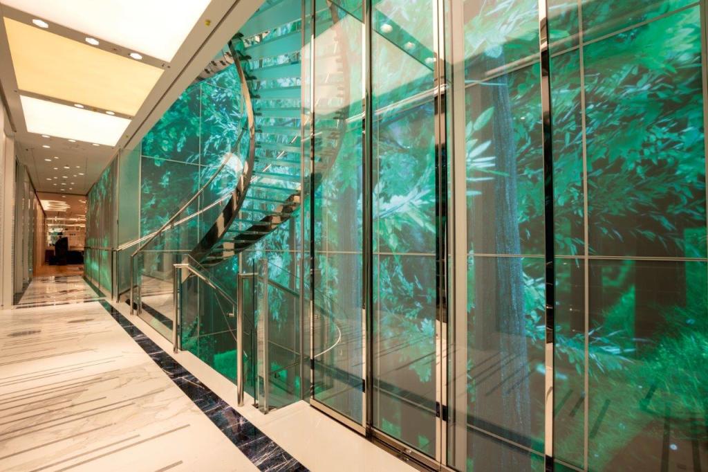
There were also the intelligent design tricks used to create a feeling of light throughout the vessel both day and night: “Because light was this critical factor, we put the main interior passageways along the starboard side instead of the centre where they normally are located,” she explains. When it was impossible to penetrate the exterior of the design, fake skylights with lights were created. The beach club and certain bathrooms are some examples of this. “I used a lot of reflective surfaces and large LED wall panels, too,” she continues.
Glass, “in all its forms,” she says, is her favourite material. “The sense of invisible walls and walls that are always in movement is something I’ve played with for over 20 years; this idea that I don’t want a static wall by my side to hem me in,” she says. This was a client that allowed her to explore all the possibilities of it.
Inside out
The yacht was designed from the inside out, a decision that came from the client. Zaniz says it was “very smart”. “That’s where you’re spending most of your time when you’re on the boat. The only person that’s really looking at it from the outside is a stranger”, she reasons. The exterior design, therefore, was influenced by the requirements of the interior.
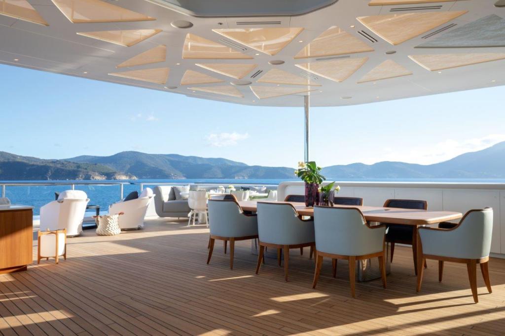
“We designed low bulwarks so that when you are seated inside you could be connected to the exterior”, she explains (the railings have, however, been designed with integrated hooks to hang up netting for when small children and animals are on board). The aft- and foredeck spaces are exterior versions of the interiors that open onto them to further ensure this flow between inside and outside.
It was also a client request that this link to the exterior extend to an unlikely aspect of the design: the ceilings. “I was asked at the beginning of the project to pay a lot of attention to the detail in all of the ceilings”, she explains. For instance, the ceiling design of the master bedroom flows through to the ceiling of the aft exterior. A similar symmetry can be spotted in the main salon. “When you are seated in a space, sitting with friends, for example, you look up more than you look down,” she explains.
A black canvas
“Originality was really critical for the client”, Zaniz says. “He wanted a work of art”. Yet, no matter the brief, her design process is always based on the same principle: “An understanding of the physical and psychological relationship to space”, she explains. “It is a fundamental building block in all my design work and my process of how I go through designing something”, she continues.
A timeline was drawn up of the key art movements and historical events from 1920 to today, as well as into the future. An “inspirational springboard”, it was then used to create a story for each room. “This was essential to integrating a deeper meaning into the design”. A significance is attached to every feature. “Each detail tells a story, or is part of one, so that it feels like a whole”, she says.
To the casual observer, the connections may not be obvious, but they are everywhere. “It would take me days to explain all of them”, she says. The LED bulbs that comprise the light fixture in the main salon is a nod to Thomas Edison, while the giant eye gazing upwards from the base of the 18 metre, five-floor staircase towards the atrium skylight was inspired by the famous Man Ray Larmes (Tears) photograph. Roy Lichennstein’s pop art speech bubbles can be felt on the marble design in the rotating floor in the main salon.
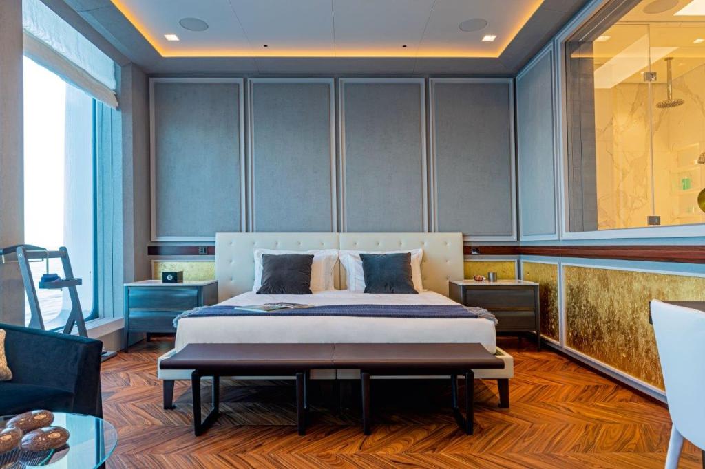
“One of the staterooms has a concrete wall with a gold rupture in the middle because the Berlin Wall came down during this period”, she adds.
“The client really let me loose with my imagination”, she reflects. “He wanted creative elements put in places where there had never been before”. Having already worked on numerous projects together, there was an inherent trust and respect that made the process easier. “The right client makes a great end product but what is also great is the journey to get there”.
When you have thought out even the smallest detail on a yacht with a volume of 5,844GT, is it even possible to name your favourite space?
I love that we managed the ceiling height and window sizes. And the main entrance lobby is exactly as I presented it in the concept design in 2011: open and inviting.
Yet, it’s over the less visible details where her thoughts linger: such as down in the under lower deck’s temperature-controlled storage rooms.
I love the flower storage. When the flowers arrive in boxes, they get unpacked into individual black storage units just like at a florist. Adjacent to them is a flower arranging area with a giant retractable foot-controlled tap for large vases so as to not damage the flowers.
Read it on ISSUE – click on cover


